Recommendations carousels can be inserted in your webpage with Doofinder. Make the most of your carousels by learning how to position them effectively and choosing the best selectors for the desired page type.
Here is what you will learn in the following documentation:
- How to Choose a CSS Selector - Best Practices
- How to Place the Recommendations Carousel
- Choosing a CSS Selector for Your Page Type
- Display Recommendations in Different Devices
You can either read all sections or jump to the one that interests you most by clicking a title in the “On this post” menu on the right side of the page. If you prefer a brief summary, refer to the CSS Selector documentation.
You will find below the steps for option 1 and option 2 of how to find the CSS selector:
Option 1:
Visual Placement
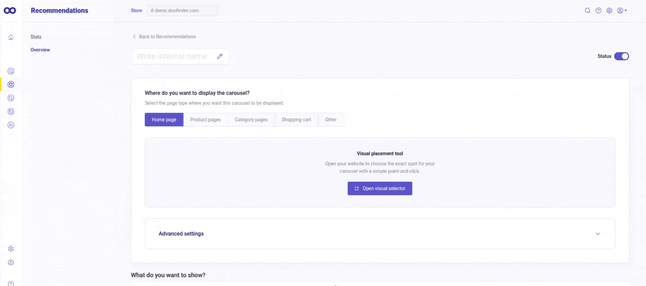
This functionality will help you to place your Recommendation carousels more effectively on your web. When creating a new carousel, you can click on the "Open visual selector” button, to see a preview of your website, and find an appropriate spot.
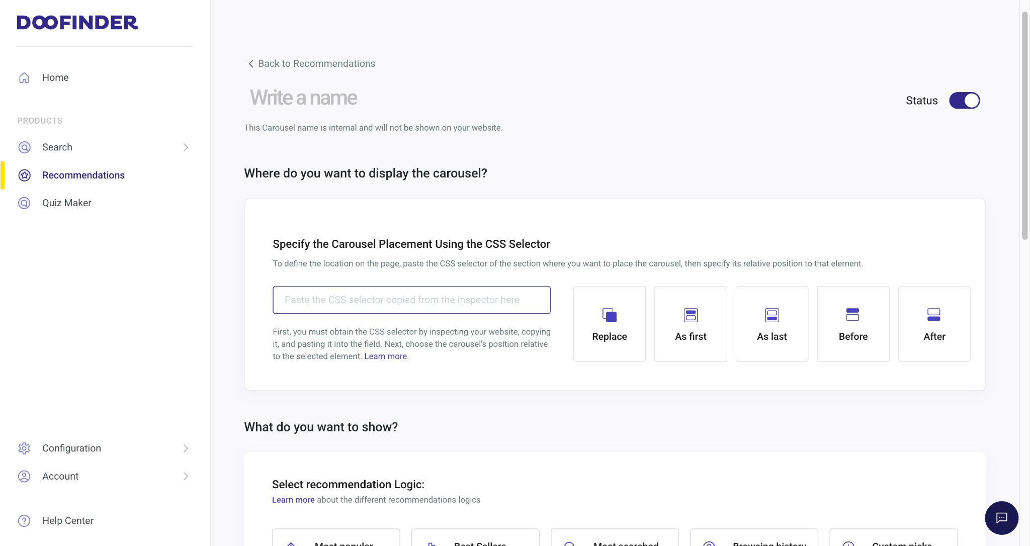
The option to manually find a CSS selector remains active and can be found under "Advanced settings" and the steps can be found from How to Choose a CSS Selector for Recommendations steps below.
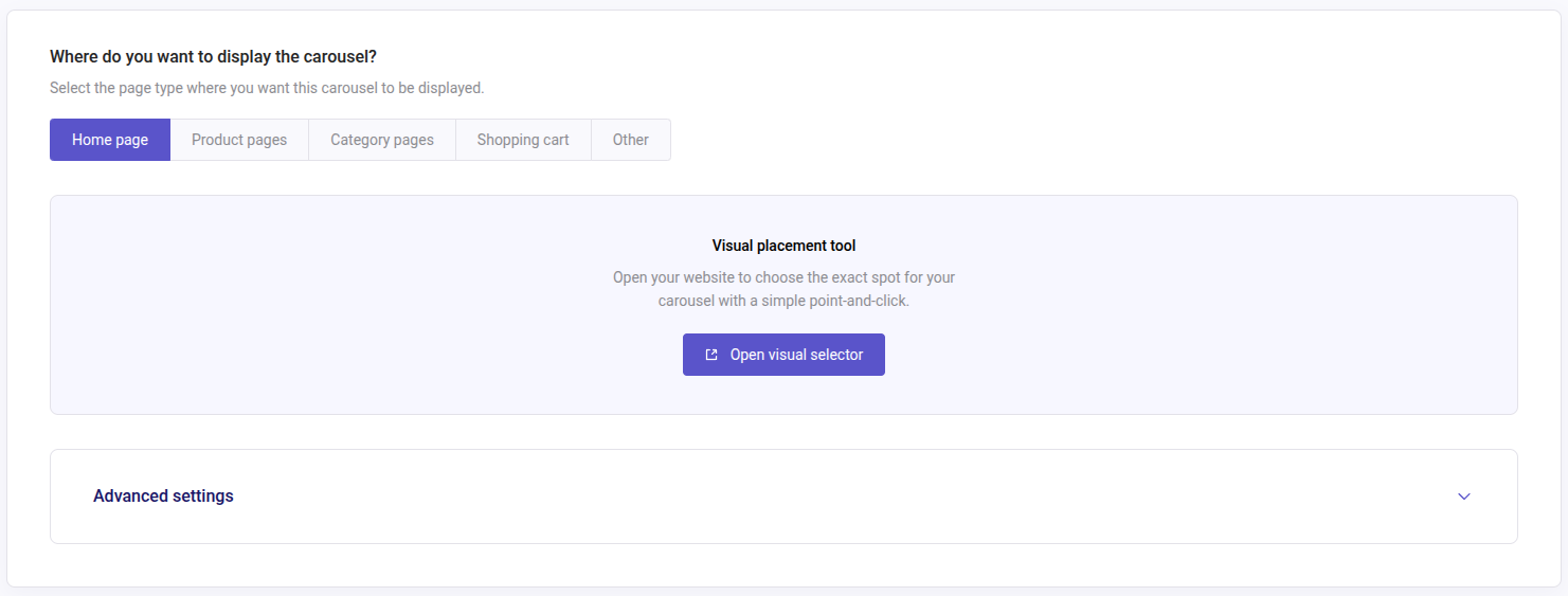
Where do you want to display the carousel?
- In the initial step of this section you can choose among “Home page”, “Product page”, “Category pages”, etc. This is the page within your web where you want to display your recommendations.
- Once you click on "Open visual selector" a new window will pop up, and you will see the following options:
- Page: your admin URL (typically the homepage if you haven’t selected another option previously). Manually introduce the desired URL in the Carousel placement box if the default isn’t the expected one. Notice that you must be in “Navigation” mode in order to edit it.
- View: desktop or mobile.
- Mode:
- Navigation: browse through your web to find the place where you want to add the carousel.
- Select: use the selector mode to hover over your web elements and select the exact spot where to add your carousel. Upon click, you will have the option to set the positioning (above/below element, replace, etc.).
If the carousel is inserted in a location that appears across multiple pages, the carousel will be displayed on all those pages during navigation.
Page URLs
The URL you put in the interface is just an example to show where the carousel should appear. It can represent:
- One specific page (like the homepage or cart).
- Or, a type of page (like all product pages).
How does the system know if you mean to target just that one page or many similar pages?
Firstly, in the admin you need to specify exact URLs if you want the carousel to appear only on certain pages.
If you don’t do that, then the system will use the CSS selector rule alone. And what happens then? The carousel will show up on every page that contains that CSS element, even if that wasn’t the intention.
In summary: if you want precise control > define exact URLs. If you don’t > it will appear on any page that matches the CSS selector.
How to Choose a CSS Selector for Recommendations - Best Practices
Read the following do's and don'ts to choose the correct selector and determine the best carousel placement for your eCommerce goals.
✓ Do's
- Use browser developer tools > Inspect Element to find the exact class or ID for your store’s layout.
- Ensure the selector is specific enough to avoid conflicts with other elements.
- Choose stable elements: Select a wrapper div or a container that is unlikely to change when the website updates.
- Use IDs when possible: If an element has an ID (e.g.,
#product-list), it’s usually more reliable than a class (.product-list). - Test different positions to determine the most effective placement for user engagement.
✕ Don'ts
- Avoid too specific selectors: A selector like
div.container > div.row > div.col-md-6might break if the store updates its layout. - Don't use autogenerated class names: If a class name looks like
.abc123-xzy456, it’s likely dynamic and may change. - Avoid using XPaths unless necessary: They are often fragile and harder to maintain than CSS selectors.
Option 2:
How to place a Recommendations Carousel
-
Click anywhere on your webpage with the right button and click inspect.
-
Select the box on the toolbar and inspect the page to find where you would like to place the Recommendations Carousel. Choose an element that works for you.
-
Once you know where to place it, search for the selector in the HTML code. The element you pick will be colored on the page.
-
Unfold the element to find the selector and choose ID(
#product-list) or class (.product-list). -
If it corresponds to the size and place you would like for the Recommendations Carousel, copy the selector and paste it into your carousel, in the "Specify the Carousel Placement Using the CSS Selector" box, then “Save”.
-
Now, choose the position of the Recommendations carousel according to the element selected and the position decided. It can Replace the element; it can be positioned As first or As last within the element; or Before or After the element.
-
Try the desired position until obtaining the desired result.
Note that you can choose multiple CSS selectors. If the first one you use doesn't work, Doofinder Recommendations will automatically use the next one.
For example, if you enter: .page,body>footer in the CSS Selector field and .page doesn't exist, the selector body>footer will be used instead. However, if the first selector you choose, such as .page does exist, Doofinder Recommendations will use that one, as it always uses the first available selector.
If you're unsure whether you have selected the best CSS selector, keep reading to learn how to choose one based on your page type.
Choosing a CSS Selector for Different Page Types
Choose the Best CSS Selector for Your Home Page, Product Page, Category Page, Shopping Cart Page, and Specific Page. Keep reading to discover the most relevant elements that align with each page type's criteria.
The Recommendations widget will only be rendered on those pages configured with the corresponding CSS selector. Therefore, if the CSS selector we choose appears on product and category pages but not on the homepage, then recommendations will be displayed on product and category pages, but not on the homepage.
Now, read on the following best practices for a correct placement and functionality on each page type.
Home Page - CSS Selector
The home page typically consists of a main content wrapper containing elements like banners, featured categories, and product grids. It is best to place the carousel within a larger structural container.
- Recommended Selector:
- Select a high-level container such as
.main-content,.homepage-container,#MainContent, or#footer. - Or a direct child of the main layout wrapper:
.main-content .featured-products,#MainContent .content-for-layout.
- Select a high-level container such as
Product Page - CSS Selector
Product pages follow a structured layout where product images, descriptions, pricing, and add-to-cart buttons are enclosed within a .product-detail or similar container. Carousels are typically used for related products, recommendations, or upsells and should be placed near these sections.
- Recommended Selector:
- Target the
.related-productssection: .product-page .related-products. - Or position the carousel after the product details block:
#main .product-container.js-product-container. - Or you may want to place the carousel right after another key element, such as the product description, details, or price section:
#product-comments-list-header.
- Target the
Category Page - CSS Selector
Category pages use a grid-based layout with a category banner, filters, and product listings. Carousels should be placed either below the category banner or above/below the product grid to highlight featured items, best-selling, or new arrivals.
- Recommended Selector:
- Target the category wrapper:
#category,,.category-page .product-grid. - Or place the carousel adjacent to the product list, or a featured section within the category:
#category-13.category.
- Target the category wrapper:
Shopping Cart Page - CSS Selector
The cart page consists of a cart summary and checkout section, often wrapped in a .cart-container. Carousels should be placed near upsell/cross-sell suggestions, usually found below the cart contents or next to the checkout button.
- Recommended Selector:
- Target a stable cart summary container:
.cart-summary.
- Target a stable cart summary container:
Specific Pages - CSS Selector
Specific pages (landing pages, custom promotional pages, blogs) have unique structures and might not follow a standard layout, therefore placement varies depending on the layout and content. The carousel should target an appropriate container relevant to the page’s purpose.
To find the best selector for specific pages you can either look for a CSS selector specific to the section or page where you want to insert the carousel; or use a universal selector, one that you can find on all pages, in combination with another identifier.
Using a Specific CSS Selector
This approach targets and identifies a dedicated section inside these unique structures, where the carousel could be inserted.
- Recommended Selector:
- Target a specific custom wrapper:
.product-grid. - Or place the carousel relative to a key content block, identify a unique class or ID associated with the specific page:
#landing-page > .product-grid.
- Target a specific custom wrapper:
Using a Universal CSS Selector
This approach uses a selector that exists on all pages, such as #footer. Then, you apply additional conditions to make sure the carousel appears only on the desired page. Since #footer is a global element, you need to combine it with a page-specific class, body attribute, or URL-based identifier.
- Recommended Selector:
- Combine
#footerwith a page-specific identifier found in the<body>tag or another element unique to that page. If the<body>tag has a class indicating the current page (e.g.,body.product-page):.product-page #footer. - If your site adds an ID to the
<html>or<body>tag dynamically based on the URL (e.g.,id="page-123"), you can use:#page-123 #footer.
- Combine
Display Recommendations in Different Devices
If you want to display Recommendations differently on desktop or mobile, you can do it by using different CSS selector.
To position the carousel on different placements according to the device, follow one of these options:
Modify Unique Classes in Your HTML for Each Device.
For example, on the product page for desktop, we might have a div similar to this one:
<div class="dfd-recommendation-widget-desktop"> </div>
Therefore, on pages where this selector can be identified, the carousel will be displayed. In this case, on product pages for desktop.
Since this specific selector won't be found for mobile, the Recommendations carousel will not be visible.
Media Query to Hide The Carousel
Alternatively use a media query to hide the carousel.
- Configure your Recommendations carousel.
-
After configuring the Recommendations carousel, the following CSS rules can be applied.
Note that the following rules are examples and you will need to modify them to your needs.
-
To hide the carousel on mobile devices:
@media only screen and (max-width: 768px) {.dfwidget-host {display: none;}} -
To hide carousel on desktop devices:
@media only screen and (min-width: 1024px) {.dfwidget-host {display: none;}}
-
-
To use them go to the Recommendations panel, scroll down to Advanced Configuration > CSS > click on “Customize”.
By using these queries, we ensure displaying the carousel just where we want.