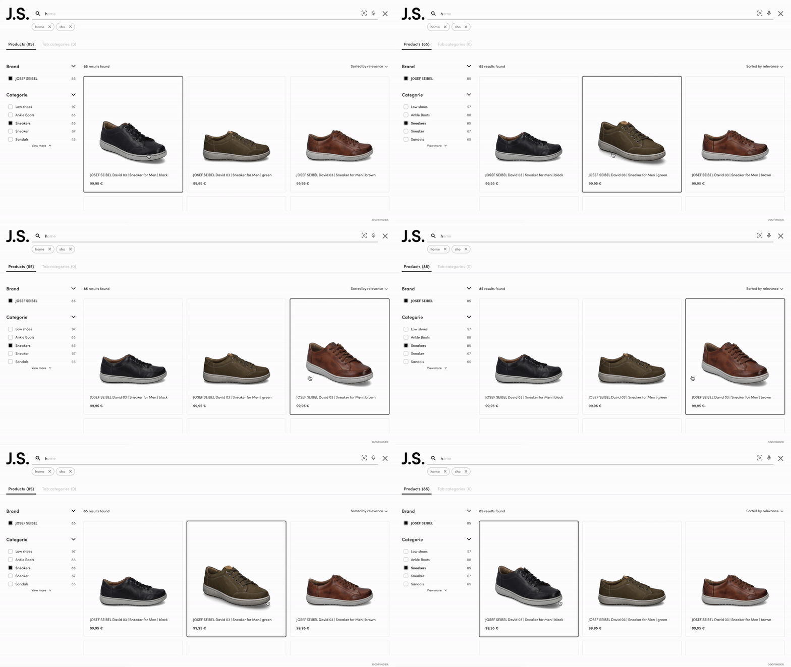
Incorporating hover images into your e-commerce store can transform the way customers interact with your products, providing them with a closer look at items, increasing engagement and encouraging exploration.
By eliminating the need for additional clicks, hover images streamline the browsing process and make it more intuitive for customers.
While there's no default setup for this feature, don't worry! It's easier than you think. With a simple CUSTOM CSS setup, you can add dynamic hover images to your e-commerce site, making shopping more exciting for your customers.

Key Consideration
Before proceeding, ensure you have indexed two image links in two different attributes. Here's an example:
"image_link": "myProductImageURL.jpg",
"secondary_image": "mySecondProductImageURL.jpg"
Keep in mind that the secondary image is optional. You can configure it for specific products only, as needed.
Product Card Template Modification
Firstly, let's modify the product card template to incorporate the hover image functionality. Replace "<!-CUSTOM FIELD-!>" with the name of your designated field (e.g., "secondary_image"). Here's the code snippet to be added:
Default Code:
<%= if has_value?(@item, "image_link") do %>
    <div class="dfd-card-media">
      <div class="dfd-card-thumbnail" data-dfd-role="card-thumbnail">
        <img src={@item["image_link"]} alt={@item["title"]}>
      </div>
    </div>
  <% end %>
New Code:
  <%= if has_value?(@item, "image_link") do %>
    <div class="dfd-card-media">
      <div class="dfd-card-thumbnail" data-dfd-role="card-thumbnail">
        <img src={@item["image_link"]} alt={@item["title"]}>
      </div>
    </div>
    <div class="dfd-card-thumbnail-secondary" data-dfd-role="card-thumbnail-secondary">
      <%= if has_value?(@item, "secondary_image") do %>
        <img src={@item["secondary_image"]} alt={@item["title"]}>
      <%= else %>
        <img src={@item["image_link"]} alt={@item["title"]}>
      <%= end %>
     </div>
     <% end %>
Custom CSS Implementation
Next, let's introduce the custom CSS that will enable the image change upon hover. Below are the CSS rules for both desktop and mobile versions:
/* Desktop Version */
.dfd-card-thumbnail-secondary img, .dfd-card-thumbnail img {
    width: 100%;
    height: 100%;
    object-fit: contain;
    object-position: initial;
    margin: auto;
    position: absolute;
    bottom: 0;
    left: 0;
}


.dfd-card-thumbnail-secondary {
    overflow: hidden;
    z-index: 0;
    position: relative;
    width: 100%;
    height: 0;
    padding-bottom: var(--dfd-card-thumbnail-height-ratio, 100%);
    display:none;
}


.dfd-card:hover .dfd-card-thumbnail{
  display:none!important;
}


.dfd-card:hover .dfd-card-thumbnail-secondary{
  display:block!important;
}
/* Mobile Version */
@media only screen and (max-width: 767px) {
 .dfd-card-thumbnail-secondary img, .dfd-card-thumbnail img {
    width: 100%;
    height: 100%;
    object-fit: contain;
    object-position: initial;
    margin: auto;
    position: absolute;
    bottom: 0;
    left: 0;
}


.dfd-card-thumbnail-secondary {
    overflow: hidden;
    z-index: 0;
    position: relative;
    width: 100%;
    height: 0;
    padding-bottom: var(--dfd-card-thumbnail-height-ratio, 100%);
    display:none;
}


.dfd-card:hover .dfd-card-thumbnail{
  display:none!important;
}


.dfd-card:hover .dfd-card-thumbnail-secondary{
  display:block!important;
}

