Customizing the Doofinder Quiz Maker appearance involves adjustments at two distinct levels, depending on the nature of the desired changes.
For incorporating additional data that isn't currently present in the product card, modifications to the template are required. This involves verifying that the required information is accurately indexed within your data feed. For detailed guidance on template modification, refer to the article Product Card Template.
Additionally, style customizations are achieved using CSS code. In the Quiz Maker > Advanced Configuration > CSS section of your Admin Panel, click on “Customize”. You can access certain style modifications to tailor your quiz and product card to match your store's aesthetic.
Modifying Quiz Styles in Doofinder
To adjust the style of the quiz in Doofinder, you must possess CSS (Cascading Style Sheets) knowledge. By utilizing the element inspector in your browser, you can navigate through the quiz structure and identify the classes that compose it, allowing you to apply changes to the style accurately.
Class Identification
When using the element inspector in your quiz, you can identify the classes that form part of it. Here are some examples:
.dfd-quiz-modal.dfd-card.dfd-cart-add-button
Generally, elements of the Doofinder Quiz are identified starting with dfd-.
By recognizing these classes, you can customize specific aspects of the quiz to suit your needs.
Applying Custom CSS to the Quiz
Once you have identified the CSS code you want to apply, follow these steps to add it:
- Navigate to the Quiz Maker > Advanced Configuration > CSS section of the quiz of your choice. Remember to select the Store and SE of your choice in the top bar.
- Click on "Customize" to access the customization options.
- Paste the CSS code in the provided field. Always remember to save your changes.
This process allows you to easily integrate custom CSS styles into your website's appearance, providing you with greater control over its design and layout.
Remember, when making changes to the quiz style, it's important to test them in a development environment before deploying them to production. Additionally, consider cross-browser and device compatibility to ensure a consistent experience for all users.
In this article, we'll provide you with the CSS modifications most frequently requested by our customers. Feel free to experiment with these modifications in your own quiz.
Background Personalization
.dfd-website-quiz .dfd-quiz-modal-content {
    background: linear-gradient(180deg, #B0B0B0 0%, #F0F0F0 100%);
}
Change the background color and enhance the layout with a gradient effect. Customize the hex color to match your preference.
With the previous CSS, you can achieve a look like this:
Add Image on Background
.dfd-website-quiz .dfd-quiz-modal-content {
   BACKGROUND-IMAGE: URL(https://i.pinimg.com/736x/d6/70/99/d670990fa86f31233a53a22d7bb2f4bc.jpg);
   background-repeat: no-repeat !important;
   background-size: cover;
}

.dfd-website-quiz .dfd-quiz-modal-body .dfd-quiz-form-slide-consent {
   color: var(--Specific-Content-3, #ffff);
}
Change the background color of the image to enhance personalization. Replace the image URL with one of your choice. This code will change the background for the entire quiz.
Example:
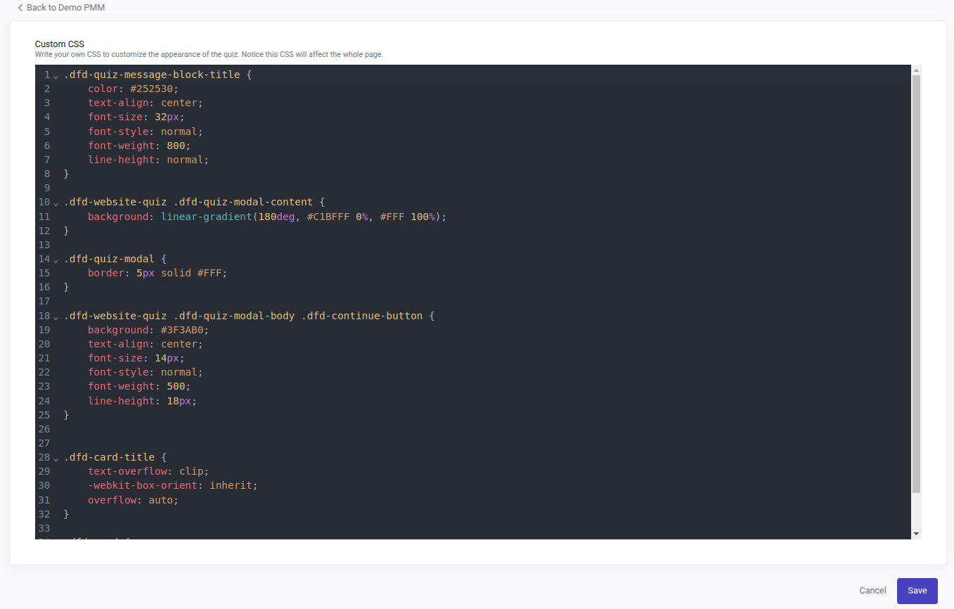
Modify the Continue Button
.dfd-website-quiz .dfd-quiz-modal-body .dfd-continue-button {
   Background: gray;
   text-align: center;
   font-size: 14px;
   font-style: normal;
   font-weight: 500;
   color: white;
   line-height: 18px;
   border-color: white;
     Border-style: solid;
   text-decoration-skip-ink: gray;
   cursor: pointer;
   user-select: none;
   Gap: 4px;
}

.dfd-website-quiz .dfd-quiz-modal-body .dfd-continue-button:hover {
   background: lightgray;
   color: black;
}
If you are adding a message to your quiz, this CSS redesigns the initial "Continue" button.
With .dfd-website-quiz .dfd-quiz-modal-body .dfd-continue-button you can change the color to one that has a gray background, white text, and a solid white border.
With .dfd-website-quiz .dfd-quiz-modal-body .dfd-continue-button:hover you can style the background when hovered. In this case it changes to light gray, and the text turns black for better contrast. If in this case you want to change the border too just add the border-color and border-style elements. Change the colors and style the button to your preference.
Take a look at the example:
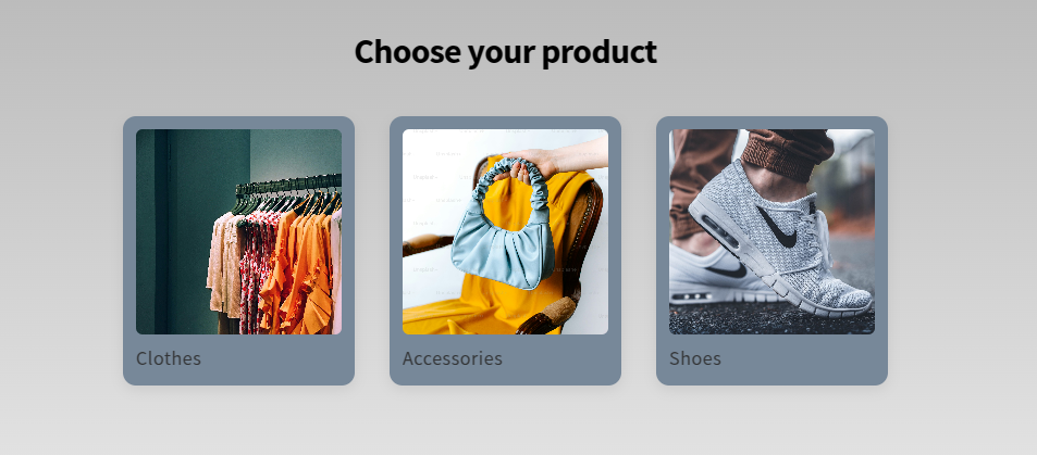
Change the Title Appearance
.dfd-website-quiz b, .dfd-website-quiz strong  {
    color: black;
    text-align: center;
    font-size: 32px;
    font-style: normal;
    font-weight: 800;
    line-height: normal;
}
Modify the appearance of the title in your questions, messages or forms. With this CSS you will change the color of the title, will make the words bigger by changing the font-size and thicker by adding more weight to font-weight.
It will look like this:
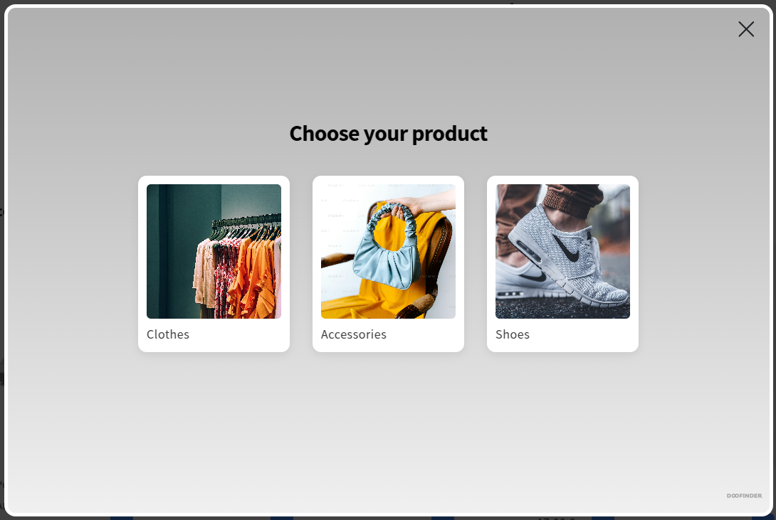
Modify the Quiz Product Card
Change the Background Color
.dfd-quiz-modal .dfd-card {
    background-color: lightslategray;
   }
Use this CSS to style the background of the product card. Change the color to your preference. For the purpose of this example we have used a dark gray:
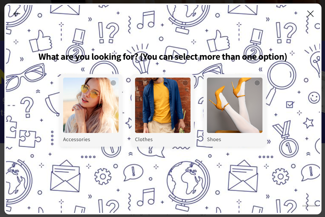
Change the Border Color of the Card for a Personalized Touch
.dfd-quiz-modal .dfd-card {
    background-color: whitesmoke;
    border: 2px solid darkred;
    border-width: medium;
    transition: transform 0.3s ease, box-shadow 0.3s ease;
   }

.dfd-quiz-modal .dfd-card:hover {
    transform: translateY(-5px);
    box-shadow: 0px 4px 8px rgba(0, 0, 0, 0.2);
    border-color: black;
}
Apply the above CSS to style the border of the product results card. This will add both color and width to the card's border, as well as a hover effect that changes the border color when the user hovers over it.
To apply the same styling effect to the question and answer cards in the Quiz Builder, use the following CSS code. It will replicate the exact same appearance:
.dfd-website-quiz .dfd-quiz-modal-body .dfd-quiz-modal-choices label .dfd-card {
    background-color: whitesmoke;
    border: 2px solid darkred;
    border-width: medium;
    transition: transform 0.3s ease, box-shadow 0.3s ease;
   }

.dfd-website-quiz .dfd-quiz-modal-body .dfd-quiz-modal-choices label .dfd-card:hover {
    transform: translateY(-5px);
    box-shadow: 0px 4px 8px rgba(0, 0, 0, 0.2);
    border-color: black;
}
Use both to achieve the complete look, as shown in the example below:
Make the Product Card Lift on Hover for a Dynamic Effect
.dfd-quiz-modal .dfd-card {
    transition: transform 0.3s ease, box-shadow 0.3s ease;
}
.dfd-quiz-modal .dfd-card:hover {
    transform: translateY(-5px);
    box-shadow: 0px 4px 8px rgba(0, 0, 0, 0.2);
}
Add a dynamic touch by creating a lift effect and a subtle background shadow on the product card. Copy and paste the CSS to add this effect to your quiz.
Take a look at the lift effect on hover:
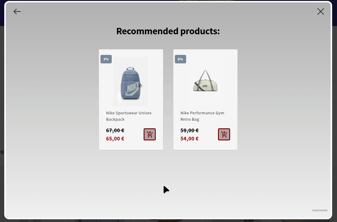
Customize the Price Color
.dfd-quiz-modal .dfd-card-price {
    color: darkred;
    font-weight: bold;
    font-size: 18px;
}
With this CSS code you will be modifying the color, font size and weight of the sale price of a product card, and the color, font size and weight of the original price when no sale price is applied in the product card.
.dfd-quiz-modal .dfd-card-price--sale~.dfd-card-price
{
    color: black;
    font-weight: bold;
    font-size: 18px;
}
With this CSS code you will be styling the color, font size and weight of the original price (the one that appears crossed) when there is a sale price applied on the card. If you don’t add this CSS, the original price will appear as default.
Style both for a perfect fit for your eCommerce just like in this example:
Flags Personalization
.dfd-card-flags .dfd-card-flag {
    position: absolute;
    top: 10px;
    left: 5px;
    background: gray;
    color: white;
    padding: 5px 10px;
    font-size: 12px;
    font-weight: bold;
    border-radius: 4px;
}
If you want to modify the appearance of the flags on your product card, with this CSS you can change the placement of the flags to the left side, round the borders, and change the background color. Play with the pixels and the colors until you create the flags of your choice.
Take a look at the example:
Style the Add to Cart Button on the Quiz
.dfd-card .dfd-cart-add-button {
    background-color: darkgray;
    color: var(--dfd-btn-color, darkred);
    border: solid var(--dfd-btn-color, darkred);
    padding: 2px 3px;
    font-size: 14px;
    font-weight: bold;
    border-radius: 4px;
    cursor: pointer;
    transition: background-color 0.3s ease, transform 0.2s ease;
}

.dfd-card .dfd-cart-add-button:hover {
    background-color: gray;
    border-color: var(--dfd-btn-hover-color, black);
    color: var(--dfd-btn-hover-color, black);
    transform: scale(1.05);
}

.dfd-cart-add-button {
    --dfd-btn-color: darkred;
    --dfd-btn-hover-color: black;
}
This CSS styles an "Add to Cart" button with a dark gray background, dark red text, and a solid dark red border. When hovered, the button's background changes to gray, and the border and text color shifts to black, while the button slightly enlarges for a dynamic effect. Custom properties (--dfd-btn-color and --dfd-btn-hover-color) are used to manage the button's colors and hover effects, allowing for easy customization.
Make your add to cart button to go from this:
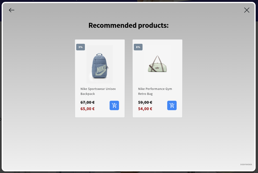
To this: