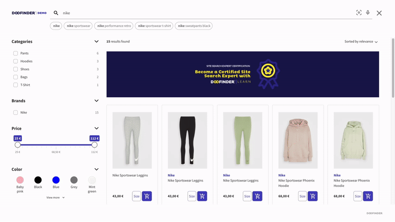
Customizing the Doofinder layer involves adjustments at two distinct levels, depending on the nature of the desired changes.
Firstly, for incorporating additional data that isn't currently present in the product card, modifications to the template are required. This involves verifying that the required information is accurately indexed within your data feed. For detailed guidance on template modification, please refer to the following article "Product Card Template".
Additionally, style customizations are achieved using CSS code. In the Layers > Appearance section of your Admin Panel, you can access certain style modifications to tailor your layer and product card to match your store's aesthetic. However, for more advanced styling options, you can enhance it by incorporating additional CSS rules into your code.
Modifying Layer Styles In Doofinder
To adjust the style of the layer in Doofinder, you must possess CSS (Cascading Style Sheets) knowledge. By utilizing the element inspector in your browser, you can navigate through the layer's structure and identify the classes that compose it, allowing you to apply changes to the style accurately.
Class Identification
When using the element inspector, you can identify the classes that form part of the layer. Here are some examples:
.dfd-fullscreen: Used for the full-screen layer..dfd-classic: Used for the floating layer..dfd-thumbnail: Applied to images displayed on the layer.
Generally, elements of the Doofinder layer are identified starting with dfd-.
By recognizing these classes, you can customize specific aspects of the layer to suit your needs.
How To Apply The CSS Code
Once you've identified the CSS code you want to apply, follow these steps to add it:
- Navigate to the Layers > Appearance section of your settings.
- Scroll down to the Advanced > CSS section.
- Click on "Customize" to access the customization options.
- Paste your CSS code in the provided field for desktop and/or mobile, depending on your needs.
Always remeber to save your changes.
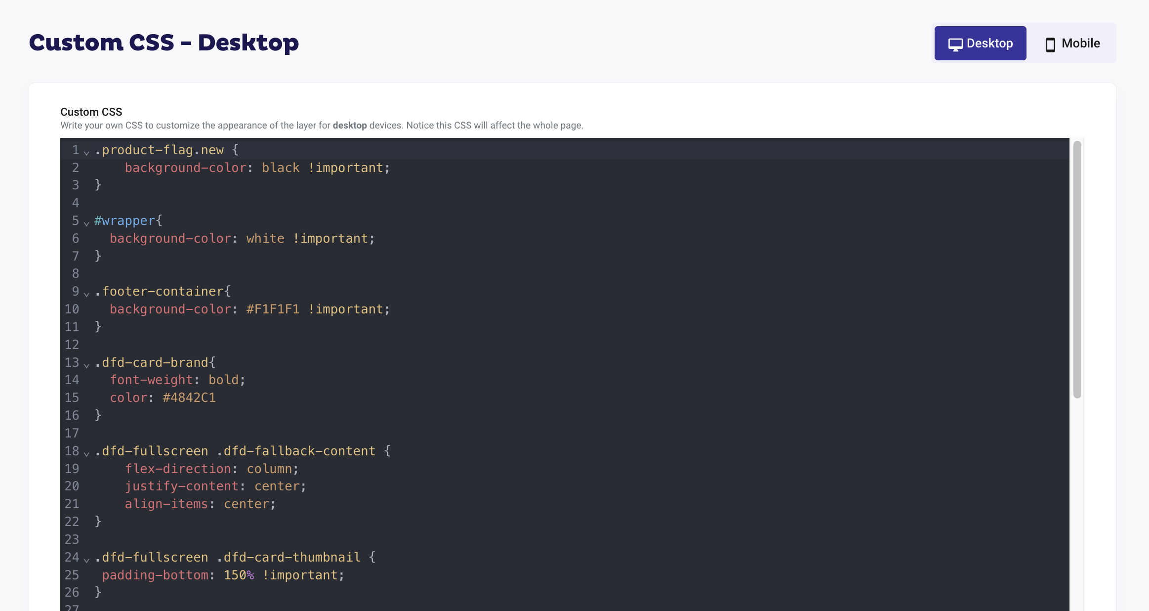
This process allows you to easily integrate custom CSS styles into your website's appearance, providing you with greater control over its design and layout.
Remember, when making changes to the layer's style, it's important to test them in a development environment before deploying them to production. Additionally, consider cross-browser compatibility to ensure a consistent experience for all users.
In this article, we'll provide you with the CSS modifications most frequently requested by our customers. Feel free to experiment with these modifications in your own layer.
Increase Size Of Logo
.dfd-fullscreen .dfd-logo {
    min-width: 300px;
}
Here's the code breakdown:
.dfd-fullscreen: This selects elements with the class dfd-fullscreen (fullscreen layer). If you are using a floating layer replace for.dfd-classic..dfd-logo: This further narrows down the selection to elements with the class dfd-logo that are descendants of elements with the class dfd-fullscreen.min-width: 300px;: This ensures that the width of the logo does not become smaller than 300 pixels, even if the content or viewport size changes. The value 300px can be modified according to your needs.
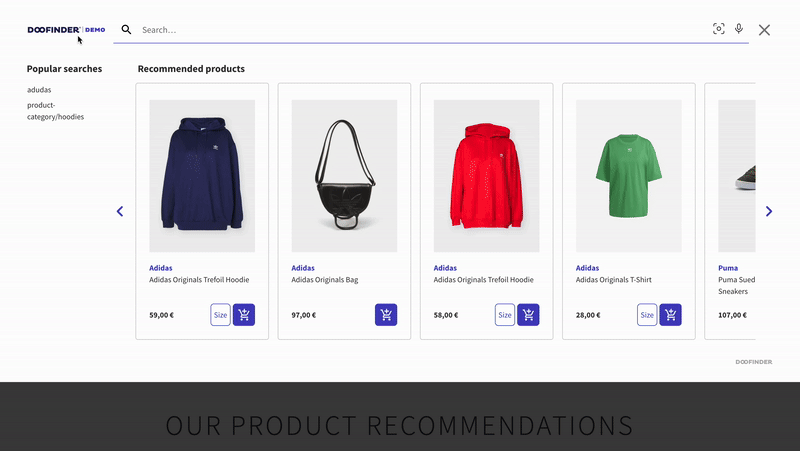
Increase Image Sizes
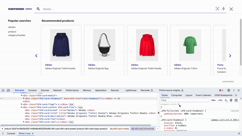
.dfd-fullscreen .dfd-card-thumbnail {
 padding-bottom: 150% !important;
}
Here's the code breakdown:
This CSS code targets elements with both the classes .dfd-fullscreen and .dfd-card-thumbnail. It sets the padding-bottom property to 150% with the !important rule, which ensures that this style takes precedence over any other conflicting styles.
Change Grid Size
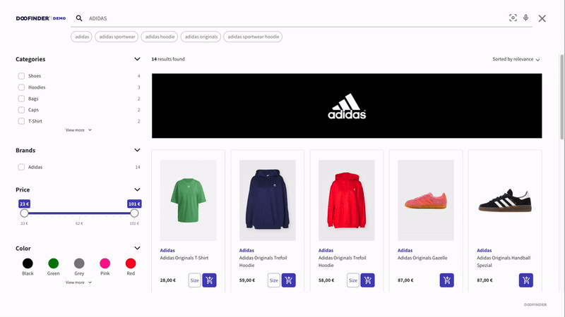
.dfd-fullscreen .dfd-results-grid {
  grid-template-columns: 1fr 1fr 1fr 1fr !important;
}
Here's a breakdown of the code:
.dfd-fullscreen .dfd-results-grid: This selector specifies elements with both the classes "dfd-fullscreen" and "dfd-results-grid".grid-template-columns: 1fr 1fr 1fr 1fr !important;: This property sets the width of the columns in the grid. Each column is set to occupy one fraction (1fr) of the available space. The "!important" declaration ensures that this style takes precedence over any other conflicting styles.
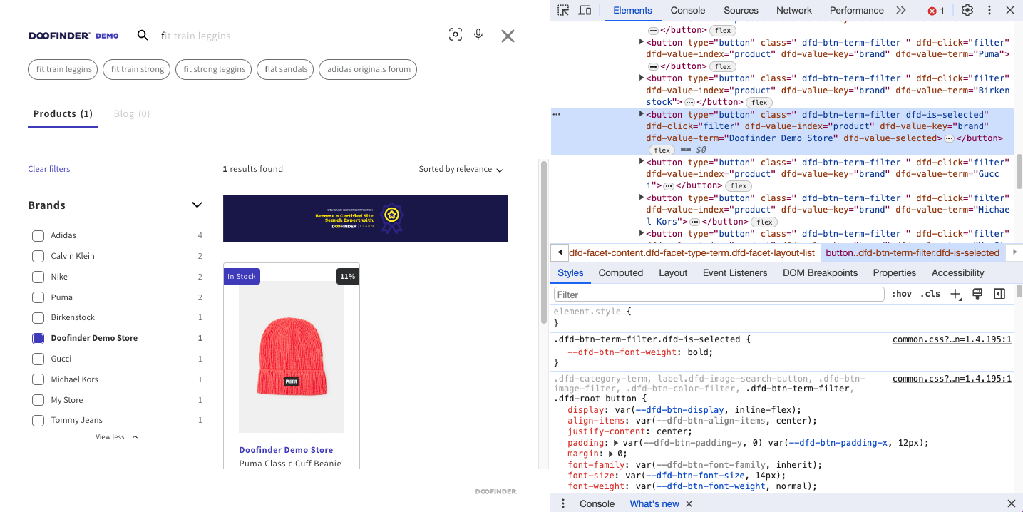
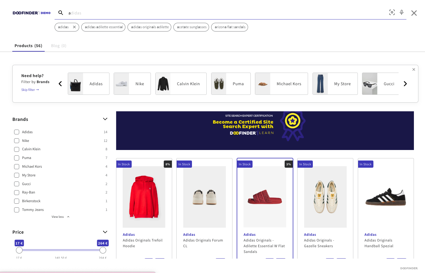
Remove Filters Values From Facets
button.dfd-btn-term-filter[dfd-value-key=brand][dfd-value-term="Doofinder Demo Store"] {
    display: none !important;
}
Before implementing the code:
In the filter Brand we can see the value "Doofinder Demo Store" as a valid option to select.
After implementing the code:
The value "Doofinder Demo Store" is hidden in the filter.
Here's the breakdown:
button.dfd-btn-term-filter: This selects all buttons with the class dfd-btn-term-filter.[dfd-value-key=brand]: This is an attribute selector that selects elements with an attribute named dfd-value-key with the value "brand".[dfd-value-term="Doofinder Demo Store"]: Another attribute selector that selects elements with an attribute named dfd-value-term with the value "Doofinder Demo Store".display: none !important;, which hides those buttons, with the !important specifier to ensure that this style rule takes precedence over other rules that may apply to the same elements.
Modify Brand Style In Product Card
.dfd-card-brand{
  font-weight: bold;
  font-size: 18px;
  color: #4842C1;
  text-align: center;
}
You can leverage additional classes to customize the style of the product card, such as:
.dfd-card-title.dfd-card-price.dfd-card-flag- And more. Remember to inspect the code using the element inspector for precise modifications.
Here's the code breakdown:
.dfd-card-brand: This is a CSS class selector targeting elements with the class .dfd-card-brand.font-weight: bold;: This property sets the font weight to bold, making the text thicker and more prominent.font-size: 18px;: This property sets the font size to 18 pixels, determining the size of the text.color: #4842C1;: This property sets the text color to a shade of purple with the hexadecimal color code #4842C1.text-align: center;: This property aligns the text to the center within its container.
Keep The Filters Fixed
You can add CSS code to prevent your filters from moving while scrolling through your search results.

FLOATING Layer
.dfd-classic .dfd-content {
  overflow-x: hidden !important;
  overflow-y: hidden !important;
}
.dfd-classic .dfd-aside~.dfd-results {
    grid-area: dfd-results;
    overflow-y: scroll;
}
.dfd-classic .dfd-aside {
   overflow-y: scroll;
}
Here's the code breakdown:
.dfd-classic .dfd-content: Targets elements with the class "dfd-content" that are descendants of elements with the class "dfd-classic".overflow-x: hidden !important;: Hides horizontal overflow for elements with this class, overriding any other styles.overflow-y: hidden !important;: Hides vertical overflow for elements with this class, overriding any other styles..dfd-classic .dfd-aside~.dfd-results: Selects elements with the class "dfd-results" that come after an element with the class "dfd-aside" and are descendants of an element with the class "dfd-classic".grid-area: dfd-results;: Sets the grid area for these elements to "dfd-results".overflow-y: scroll;: Allows vertical scrolling for these elements.*
FULLSCREEN Layer
.dfd-fullscreen .dfd-aside {
    padding-right: 25px;
   position: fixed;
    overflow-y: auto;
    overflow-x: hidden;
    height: -webkit-fill-available;
    z-index: 1;
}
.dfd-fullscreen .dfd-results {
    margin-left: 380px;
    flex: 1 1 auto;
    position: relative;
}
Here's the code breakdown:
.dfd-fullscreen .dfd-aside: Targets elements with the class "dfd-aside" that are descendants of elements with the class "dfd-fullscreen".padding-right: 25px;: Adds 25 pixels of padding to the right side of these elements.position: fixed;: Fixes the position of these elements within the viewport.overflow-y: auto;: Automatically shows vertical scrollbar when needed.overflow-x: hidden;: Hides horizontal overflow for these elements.height: -webkit-fill-available;: Sets the height of these elements to fill the available vertical space in WebKit browsers.z-index: 1;: Sets the stacking order of these elements relative to other elements on the page..dfd-fullscreen .dfd-results: Targets elements with the class "dfd-results" that are descendants of elements with the class "dfd-fullscreen".margin-left: 380px;: Adds a left margin of 380 pixels to these elements.flex: 1 1 auto;: Allows these elements to grow and shrink as needed.position: relative;: Positions these elements relative to their normal position on the page.
Change Layer Background Color
In this example, we'll modify the background to grey to vividly demonstrate the contrast of the alteration.
.dfd-fullscreen .dfd-layer, .dfd-card, .dfd-fullscreen .dfd-initial-content .dfd-popular-searches, .dfd-meta, .dfd-aside {
  background: grey !important;
}
.dfd-searchbox-input, .dfd-searchbox-autocomplete {
  color: black !important;
}
Here's the code breakdown:
.dfd-fullscreen .dfd-layer, .dfd-card, .dfd-fullscreen .dfd-initial-content .dfd-popular-searches, .dfd-meta, .dfd-aside: This is a CSS selector targeting multiple elements.background: grey !important;: This sets the background color of the selected elements to grey. The !important rule ensures that this style takes precedence over other styles applied to these elements..dfd-searchbox-input, .dfd-searchbox-autocomplete: This is another CSS selector targeting two different classes.color: black !important;: This sets the text color of elements with these classes to black. The !important rule ensures that this style takes precedence over other styles applied to these elements.
Adapted Fullscreen Layer
You have the flexibility to adjust your fullscreen layer to a smaller size, creating a floating appearance while retaining the functionalities typically associated with fullscreen elements, like displaying your brand logo or using a magnifying glass icon to trigger the layer, for example.
.dfd-fullscreen.dfd-animate .dfd-layer {
  width: 75%;
  border-radius: 25px !important;
  margin-left: 225px;
}
.dfd-fullscreen.dfd-animate .dfd-layer {
  opacity: .9 !important;
}
.dfd-root.dfd-animate .dfd-backdrop {
  opacity: .5!important;
}
.dfd-fullscreen .dfd-branding {
  display: none !important;
}
.dfd-fullscreen.dfd-animate .dfd-layer {
  margin-top: 25px;
}
Here's the code breakdown:
.dfd-fullscreen.dfd-animate .dfd-layer: Targets elements with both the classes "dfd-fullscreen" and "dfd-animate" that are descendants of elements with the class "dfd-layer".width: 75%;: Sets the width of these elements to 75% of their container.border-radius: 25px !important;: Sets the border radius of these elements to 25 pixels, overriding any other conflicting styles.margin-left: 225px;: Adds a left margin of 225 pixels to these elements..dfd-fullscreen.dfd-animate .dfd-layer: Targets elements with both the classes "dfd-fullscreen" and "dfd-animate" that are descendants of elements with the class "dfd-layer".opacity: .9 !important;: Sets the opacity of these elements to 90%, overriding any other conflicting styles..dfd-root.dfd-animate .dfd-backdrop: Targets elements with both the classes "dfd-root" and "dfd-animate" that are descendants of elements with the class "dfd-backdrop".opacity: .5!important;: Sets the opacity of these elements to 50%, overriding any other conflicting styles..dfd-fullscreen .dfd-branding: Targets elements with the class "dfd-branding" that are descendants of elements with the class "dfd-fullscreen".display: none !important;: Hides these elements, overriding any other conflicting styles..dfd-fullscreen.dfd-animate .dfd-layer: Targets elements with both the classes "dfd-fullscreen" and "dfd-animate" that are descendants of elements with the class "dfd-layer".margin-top: 25px;: Adds a top margin of 25 pixels to these elements.