


The Appearance tab lets you customize how your Recommendations carousels appear on your store, without any coding. You can adjust the carousel title, colors, card styling, and the sale price color, and see the changes in a live preview before saving.
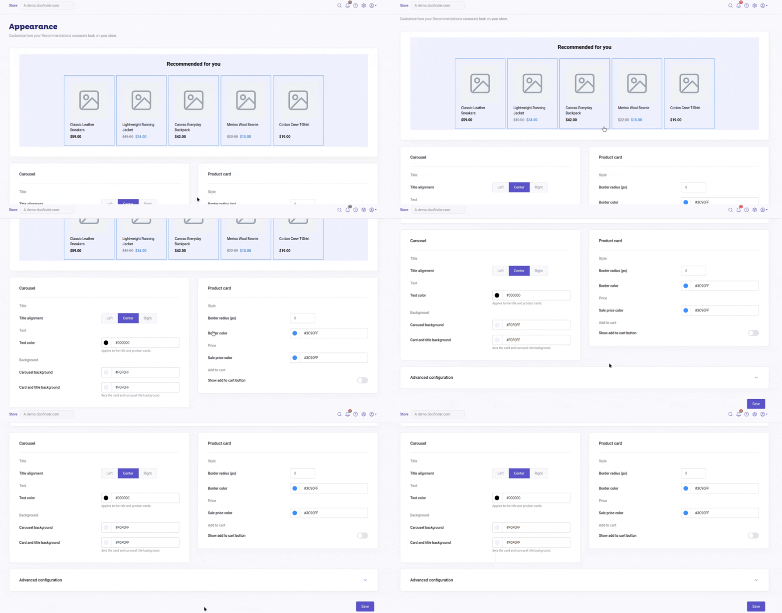
Notice that, if you've previously added custom CSS to style your carousels, you'll see a warning banner at the top of the page:

Live preview
At the top of the page, you can see a live preview of a carousel (for example, "Recommended for you"). As you adjust the settings below, the preview updates, so you can see the result before it goes live on your store.
Customization
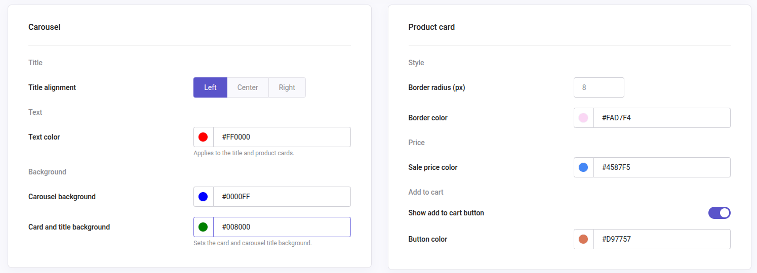
Carousel
These settings will be applied to the carousel as a whole and affect all of them in your web:
- Title alignment: choose Left, Center, or Right to position the carousel title.
- Text color: changes the color of the carousel title, the text on the product cards, and the regular price (when there are no discounts).
- Carousel background: sets the background color of the carousel area.
- Card and title background: sets the background color shared by the product cards and the carousel title.
Product card settings
These settings apply to the product cards within the carousel:
- Border radius (px): controls how rounded the corners of each product card are.
- Border color: sets the border color of product cards.
- Sale price color: sets the color used to display discounted prices.
- Show add to cart button: toggle to display an add-to-cart button directly on each product card.
Advanced configuration
For customizations beyond the available controls, expand Advanced configuration to find the CSS and Templates (HTML), which allow you to manually tailor your carrousels via coding.

Changes made in Advanced configuration are applied on top of the standard Appearance settings overriding them, as noted in the warning banner at the top of the page.